
This is for my February, 2007 book, so don't go looking for it now.
(Look for HERS TO DESIRE now!)
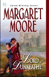
Why do I love it so? Let me count the ways:
The colors, especially the sky, the font and the heroine's dress.
The hero's mail. Okay, maybe a little skimpy on the sleeves, but I can live with that. At least his chest is covered (unlike, say, this one . Great looking guy, but why not just paint a target on yourself, fella?)
The heroine's dress. I think I've had this one before, but I like it!
The hero's face. Granted you have to see it larger to get the full effect, but yummy! The eagle-eyed Michelle Rowen thinks this may be model Nathan Camp. I'm thinking yes. Take a look. What do you think?
And last but not least, my name is HUGE! This means the Powers-That-Be think my name is a Very Important Selling Point. Yippee!
I have to say this cover ranks with my other favorite covers, also for HQN Books.

HERS TO DESIRE will be out (officially) next week. What can I say? I love the blue!
LORD OF DUNKEATHE was out in February, 2005, and is still available at Amazon.
Having looked at a larger version of the cover of LORD OF DUNKEATHE, I do believe that may be Nathan Kamp again. No complaints about that here if it is!
If you're wondering why they look similar, that's quite deliberate. It's a marketing strategy and one I quite like!
As for the new book, I've come to a sort of crossroads -- the next scene could be any one of three choices, and I'm trying to decide which one to do! This is where having a very general outline doesn't help. OTOH, I wrote a really cool short scene this morning that wasn't even in the outline.
2 comments:
It is purty! The colors are just luscious. (And so is Nathan Camp for that matter.)
I concur -- with both points!
Post a Comment